Of/By/For All
Brand Strategy, Visual Identity and Graphic Design for a non-profit startup that accelerates DEI change for civic and cultural organizations

Client
Of/By/For All is a non-profit startup that accelerates change for civic and cultural organizations by helping them become of, by, and for their communities. Through their training program, they help busy practitioners go from talking about diversity, equity and inclusion to putting it into action.
Challenge
Of/By/For All was entering their busy season for marketing and re-launching their virtual training program and needed templates for social media and their virtual program presentation that the Marketing Manager and the rest of the team could quickly and easily use. While the existing brand identity system laid a solid foundation conceptually, it no longer matched the current vibe of the organization. It felt “harsh” and “sterile” according to the team.
Approach
It was time for a visual upgrade that reflected their new leadership and more rooted identity as a BIPOC organization. I evaluated design options that built on their existing brand identity system rather than a total rebrand, an important decision for a startup still establishing itself. Ultimately I opted to expand their color palette and establish new graphic styles, then translated that into templates for use in social media and presentations.
Expertise
Brand Strategy, Visual Identity, Graphic Design, Communications Strategy, Social Media Strategy
Tools
Adobe Illustrator, Photoshop, Canva, Google Slides, Slack

Brand Identity
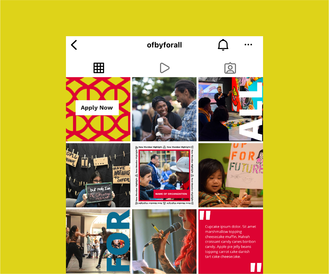
Smallest Change, Biggest Impact
Listening to the client’s complaints of “starkness” in their brand identity system, I determined that expanding the color palette to match their values would make the biggest impact. Using color theory, I rapidly generated several options for a new palette based on their primary color Ribbon Red. The triad, which distributes colors evenly around the color wheel causing there to be no clear superiority of one color, was the exact metaphor that represented this organization’s commitment to diversity, equity and inclusion.

“Adding those other colors has been really transformative for us.”
-Courtney Harge, CEO


Extending Motifs
Again, I wanted to expand on what they already had. I tessellated the logo and transformed it to use as a textured background with many color and scale variations. This extended the motif of “networks” and was reminiscent of the designs on ethnic cloths from around the world. They loved this idea, so I ran with it and applied the same treatment to the “slash” used prominently in their name.


Simplifying Social Media
Once we had all our design elements to work with, I created a series of templates for social media. The templates were based on a brainstorm of different content types from past and future ideas, which included Calls to Action, Member Highlights, Quotes and Longer Text Based Posts. Our main goals were to significantly decrease the amount of text in each graphic and make it easier for any member of the team to get a message out. Swipe to see before and after.
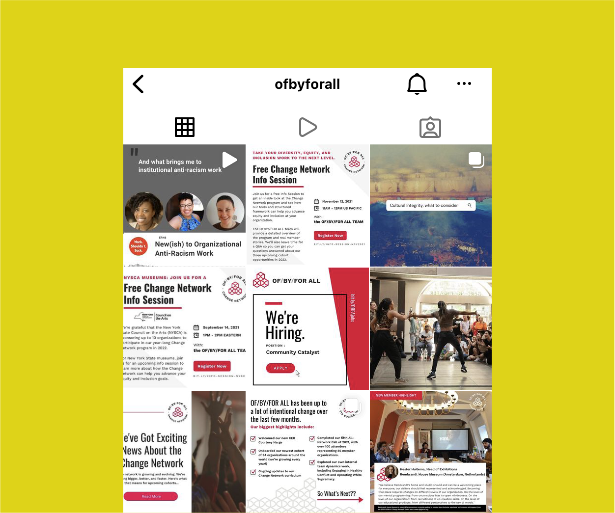

Collaborative Presentation
Of/By/For All’s virtual training program called the “Change Network” is the heart of organization. And although the Program Director designs the program, every member of the 6-person startup contributes to the training presentations. Therefore, they needed Google Slides that each member could create and still remain cohesive and on brand. I simplified the design for the presentation, but gave them options with bold typography in line with their new brand identity, programed it into Google Slides.